Showing posts with label letter. Show all posts

Tuesday, December 1, 2015

Ribbon Lettering with Cursive

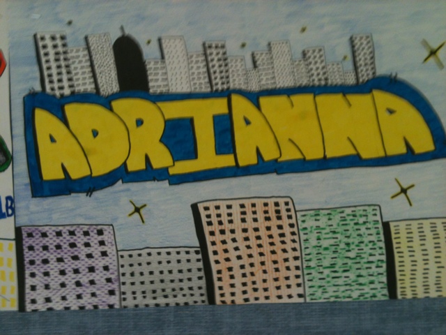
These are the results from this years attempt at ribbon letters.  It starts with cursive, finished as a 3-d ribbon!  Check out this previous post for the details on how that is done. 

1.  Cursive.  Students are supposed to learn this in 2-3rd grade, but some do not have practice.  I print out an example Cursive alphabet for them to use.  This one is called D'Nealian, a offshoot of Palmer Method.


Each student picks a name, phrase, etc that is at least 5 letters long.  They can capitalize the first letter, but the illusion of a single flowing ribbon is better captured if the rest are a string of lowercase letters.

2.  The 3-d illusion begins by picking a direction and length.  I like using about 1 inch, and up to the left at 45 degrees. Students will draw small extensions off each corner or rounded edge at the chosen angle and length, with one caveat: If something else gets in the way, the line stops.  this helps make the illusion of OVERLAPPING.

3.  The line component of the illusion is completed by finishing off the back edges.  Basically, you re-create the curves so it remains the same distance away from the original.  the original curve is in between the lines you created on the original cursive lettering.  See the examples below with the name Carthage.

4. Value: I usually have students use markers to outline the design and use colored pencils to fill in with value.  Gradual shading from light to dark helps the ribbon look rounded.  Also, when a student switches from one ribbon section to another one touching, they need to switch from light to dark, or vice versa.  this gives the greatest amount contrast to showcase the 3-d lines.


Rubric

Cursive Lettering       20
3-d lines correct         20
Gradual Shading 
on ribbon                   30
Background               10
Craftsmanship           20
Total                         100


Wednesday, January 15, 2014

Ribbon letters

RIBBON LETTERS!
This is a simple technique for getting a ribbon style letter.  There are a lot of different techniques out there, but this one makes sense for my 7th-8th graders who have never tried this before.


It starts out by writing out a word in cursive.

Then you extend the edges back in space.  They must all be the same direction, and the same length.  For example, if you draw from each edge up 1 inch at 45 degrees to the left, then they all go that same length and direction.  For curves, you pick the outermost part of the curve you can find.  See the top and bottom of the C in the "Carthage" example?

You finish the drawing by drawing in the back edge of the ribbon, which should go the same direction as the front edge (the cursive letter.)

Don't forget sometimes you have interior spaces that need to be addressed, like the o in Love in the below example.


Color is different.  You have lots of options, but I have my students use marker to outline, and colored pencils for shading.  Shading can really make you ribbon drawing seem more real.  You are trying to get the illusion of depth, and if you gradually shade from light to dark, to show overlap or distance, you can enhance the image.
  Here are some examples ...

Also, here is the link to the first post on Ribbon Letters, with step by step instructions.

Thursday, November 8, 2012

Micrography project

Sometimes called calligrams or concrete poetry, students use text to create an image. In this project, we are using an author and their work!

Students pick an author and a text.  One of the reasons we are doing this project is that a lot of students are already reading books in other classes, and this activity reinforces what they are reading and makes them investigate at least a little deeper the author of their books.

We start by going to the computer lab and searching for an image of their author.  Once they find an acceptable image, they save it and email the picture to me.  I take the picture and manipulate it with photoshop or microsoft word.  Its printed with 2 values: Black and white.  High contrast.  The black areas will be filled with text, the white areas left blank

Back in the classroom, students trace the edges of the black shapes on drawing paper LIGHTLY.

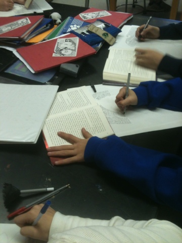
Then they open up their book and start writhing with pens.  The smaller the text, the darker the area.

This is a magical project where the image of an author is created using the words that they wrote.  Art inspired by art, crossing from language to visual and back again.